
Diagrammatic Presentation of Data
Diagrammatic presentation of data is the second method of presenting data this method promotes the quickest understanding of the actual situation to be explained by data in comparison to the tabular representation.
Diagram provide simple and attractive way to present with data. Diagrammatic presentation includes:
- Geometric form
- Frequency diagram
- Arithmetic line graph
Also, feel free to join our Facebook group.

Geometric form
Data that is presented with the help of rectangles is called a bar diagram. The geometric form includes a bar diagram and a pie diagram. Further bar diagram is divided into:
- Simple
- Multiple
- Component
Diagram comprises of equispaced and equiwidth rectangular bar for each class and category of data. They are suitable for frequency type and non-frequency type variables such as discreet variables like grades in exams and attributes such as gender, religion, etc that can be represented with the help of a bar diagram.
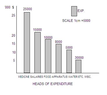
Simple bar diagram
Those diagrams which are based on a single set of numerical data are called simple bar diagram. The different diagrams represent different values. For example, the birth rate, the weight of students, etc. These can be represented either vertically or horizontally.
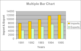
Multiple bar diagram
They are used for comparing 2 or more sets of data. For example, income and expenditure, imports and exports, marks obtained in different subjects in different classes.
Component bar diagram
It shows the bar and its sub-divisions into 2 or more components. They present total value as parts of the bar, those components of the bar are shaded with colors.

Pie diagram
It is a circle whose area is proportionally divided among the components it represents. It is also known as a pie chart under these values are first expressed in percentage of the total values of all categories. For example, the distribution of the Indian population by their working status.

Thank You!
I hope it was helpful, you can refer more posts related to the statistics.
Thank You!
Feel free to join our Facebook group and subscribe to this website to get daily educational content in your mailbox.
Happy Learning!
Disclosure: Some of the links on the website are ads, meaning at no additional cost to you, I will earn a commission if you click through or make a purchase.
Photo by Prateek Gautam on Unsplash